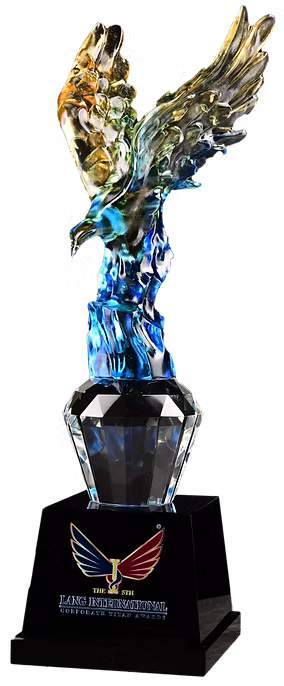
A simple and minimalistic concept that uses 2 wings coiling around the letter ” I ” to symbolize the award’s attainment of international level. The blue and red colours on the wings signify unity and courage respectively.
The word ‘LANG’ is taken from the Malay word ‘HELANG’ which means eagle. As the saying goes, “All birds find shelter during a rain, but eagle avoids rain by flying above the clouds.”, only those with the courage to go beyond their limits will succeed.
L.A.N.G is also an acronym for Lead, Accelerate, Nurture and Growth. We envision to Lead the winners to soar high for success, Accelerate their business development and Nurture talent to catalyze economic Growth.
This logo also marks the recognition for enterprises and entrepreneurs in the respect of being.